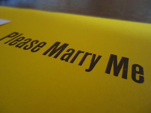
I’m printing an edition of Charles Baxter’s poem, “Please Marry Me.” The colophon will say: “Printed for The State of the Book symposium, October 6th, 2012, and in conjunction with The Great Write Off, October 3-5, 2012.”
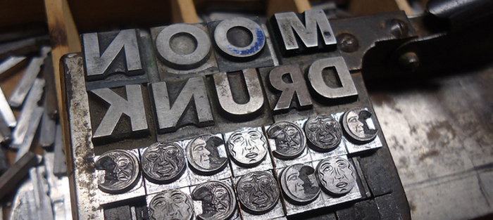
I’m setting the type by hand. Literally, I am assembling the poem letter by letter, space by space, using antique metal type in order to ink the type, and then press that type into paper, resulting in an impression called a “letterpress print.”
I’d like to say that selecting the typeface is a laborious process of fine aesthetic judgments. Sadly, it is not. Type is measured in weight; it is made of lead, antinomy and tin. A person like me, an amateur, has only a very small amount of type. When Benjamin Franklin bought a single size of type (say, what we would call 12pt Caslon, but what he called Pica Roman), he bought 300lbs of that size, which was enough to supply a very small shop like his with enough sorts (letters) to print small pamphlets, short books, broadsides, etc.
I own exactly three typefaces in sufficient quantities to set this poem: 20lbs of 12pt Century Schoolbook, 25lbs of 14pt Caslon 471 and 30lbs of 10pt Century Schoolbook. It’s a meager sum of sorts, and it feels post-apocalyptic when I say to myself, “10pt is the only thing that will fit on a half-sheet.”
There are 1694 characters (including spaces) in the poem. 306 words. There are 121 lower case ‘a’s, 156 lower case ‘e’s, 105 ‘t’s, 49 ‘d’s and 18 ‘b’s. When I look at a text that I want to print, I try to imagine each quantity of letters, mounded up and resting in the cup of my hand. The number of ‘e’s in Charlie’s poem, when balanced in my palm, is heavier than two field mice. The ‘d’s feel like loose change.
 I set slowly, my skill level equivalent to a sophomore in high school circa 1932, drawing each sort up to form a word pinched between my index finger and thumb. Most words, like “wake” and “happy” and “instep” are easily compassed this way. I dropped “contrapuntal” twice, struggling with “wonderment” and “pleasantries,” finally having to grapple with “inconsolable” syllable by syllable.
Hand-setting is slow, difficult, dirty. It’s no wonder we’ve abandoned it.
The poem is only two sentences long, the first one running deep into the 32nd line, and setting it was similarly breathless, the whole experience unmoored and falling forward, never quite stopping. The second sentence, only two and a third lines long, is the wall against which everything crumples. The speaker realizes he has misidentified Schoenberg’s music for Mahler’s, and it is as though here, in the misplaced detail, he is waking up from the dream. “Verklärte Nacht,” the Schoenberg piece based on a poem by Richard Dehmel, brings the poem, and me, crashing to a halt.
The umlauted ‘ä’ is not a common character. They say a printer is ‘out of sorts’, and I was, when I had to call one of the world’s last remaining typecasters, Brian Ferret at Mackenzie & Harris of San Francisco to have that umlaut specially cast for this edition.
But.
“Blended” is as wonderful a word to set as it is to say. Each letter in a drawer of type is a mirror image, in order to print properly, and the text is always set upside down, so that the first line is the foundation of the whole climbing tower of type. One becomes accustomed to reading this way, but it’s a kind of child’s game, like pig Latin or crossing your eyes, and it makes everything in your head grow fuzzy and soft after a while. They say, “Mind your ‘p’s and ‘q’s” for this reason, and when you set “blended,” the letters all tumbly and unsure, it sidles up next to sacred for a moment. You see the words as they were before Adam uttered them.
Language, when cast in metal like this, turns inside out.
Extras
- Read “Please Marry Me” at the Poetry Foundation.
- Watch Fritz Swanson’s entire process unfold – stills and video, with working music! – at his excellent Flickr set.
