Image credit: Flicker - Katey Nicosia
For the spa in Philippe Starck’s Icon Brickell, the icy glass condo tower in Miami, [designer Thatcher Wine] was asked to wrap 1,500 books in blank white paper, without titles, to provide a “textural accent” to the space. He chose mass-market hardcovers that flood the used book outlets — titles by John Grisham and Danielle Steel, or biographies of Michael Jackson, he said — because they are cheap, clean and a nice, generous size.
For another Starck project, in Dallas, Mr. Wine used black paper to wrap the 2,000 vintage books he picked for their “distressed edges,” so they could be displayed backward. […]
[Builder Steve] Hermann designed a glassy Neutra-like house with a 60-by-14-foot shelving system, which has room for 4,000 books, he said.
“But who has 4,000 books?” he said. “I always stage my houses, so it was up to me to fill the shelves.” He ordered 2,000 white-wrapped books from Mr. Wine and deployed them in tidy, horizontal stacks (watch for the white-wrapped book to become this year’s version of the deer head).
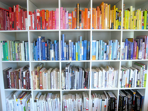
That passage, from a recent article in the New York Times about “decorative book solutions”—carefully curated (and sometimes re-covered) collections of books used for decoration—makes me feel a little ill.
The article attempted to comfort bibliophiles:
Book lovers, you can exhale. The printed, bound book has been given a stay of execution by an unlikely source: the design community. In this Kindle-and-iPad age, architects, builders and designers are still making spaces with shelves — lots and lots of shelves — and turning to companies like Mr. Wines’s Juniper Books for help filling them.

Image credit: Flicker - resakse
Worse, it’s hardly a triumph for literature if you labor to look like a reader without all the trouble of, you know, actually reading. But that’s what seems to be happening here:
“Some people will insist that [the books] be in English, because they want them to look as if they could read the books,” Mr. Weinstock said. [my emphasis]
Or:
Alexa Hampton, the New York decorator, remembers her father, Mark Hampton, buying “masses of random, leatherbound books to assemble libraries,” she said. “But the people I work for don’t want books just as backdrop or theater, which they did 20 years ago. Now they want books they actually might read.”
Is it okay to just look like a reader, to chop books in half and re-cover them with blank paper, if you’re helping create a market for print books? Or does merely looking like a reader—but not actually being one—push us farther down the road towards “Books? Is that something to read?”