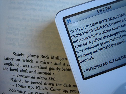
image credit - Flickr: bloomimwhom
“Designing a printed book is remarkably different from designing an ebook,” says Charles Nix, a partner in the New York publishing firm Scott & Nix and the president of the Type Directors’ Club.
“Printed-book design is about fixed-size pages and spreads. Those are gone in ebooks. Book designers choose typefaces and point sizes to maximize legibility and comprehension. Those are gone in ebooks too. Some formats, he notes, do allow you to embed a font, but you can’t rely on reading devices picking it up. Book designers finesse layouts and choose paper to achieve a particular bulk, weight, and feel for the finished book. Gone also.”
It’s not just aesthetics, Robins argues. Sometimes the differences affect the book itself:
Nicholas Blake, the editorial manager for digital at Pan Macmillan in London, shows me China Miéville’s The City and the City on Adobe Digital Editions. The City and the City is a highly praised novel and Adobe Digital Editions is a heavily supported ebook platform, backed by the UK’s largest high-street bookshop, Waterstone’s, and with an implementation of the open standard for ebooks, Epub, more sophisticated than many. But The City and the City is set in an uncanny place called Be¿el; and one thing the platform did not permit, at least with its default font, was the character ¿.
And even something like line length can have major effects:
Shorter lines also cause problems for justification (the smooth edges at either end of a page that most readers expect), especially as many e-readers don’t yet do hyphenation. Unjustified text, with the right margin left ragged, may help, but long words may cause problems even then. Blake reports trouble with The Hitchhiker’s Guide to the Galaxy, where the sigh of satisfaction emitted by the automatic doors – a string of “m”s – can disappear off the edge of the screen.
Those of you reading ebooks, have you noticed any weird design issues on your Kindle or Nook? Designers, what other design challenges might ebooks raise?


